One app store review changed everything. Then more tickets came in. A problem that had been there for years, just never anyone's priority.
User problem
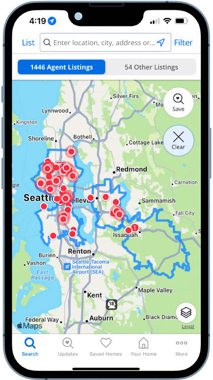
Zillow app users struggled to locate and use critical search functions, and finding the list view most of all. They felt stuck in the map, and moving between map and list was a disjointed, context-losing experience that left people lost and frustrated. Multiple research studies and a steady stream of customer support tickets said the same thing.
Business problem
The legacy map-first UI couldn't scale to support multi-region searching, natural language inputs, or rich listing cards required for Zillow's "Super App" strategy. Redesigning Zillow's highest-traffic screen meant balancing extreme usability gains with strict revenue risk management.
One change to Search moves ten metrics at once.
Research told us the drawer was right. It could not tell us what would break, so we shipped one variable at a time.
Shipped
What I shipped in 3 years
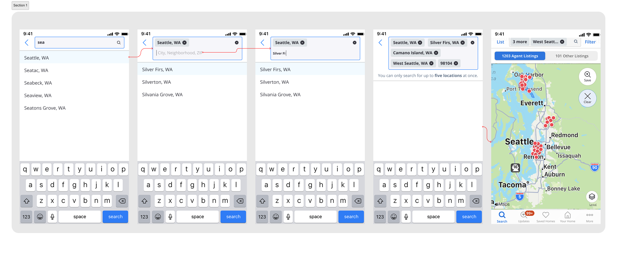
The blended map and list experience: the drawer opens to a peek, a full list, or a full map. Ability to search in 5 locations at once, search by your commute time and search near important points of interest and landmark via natural language search
Shipped on desktop and mobile web as well.
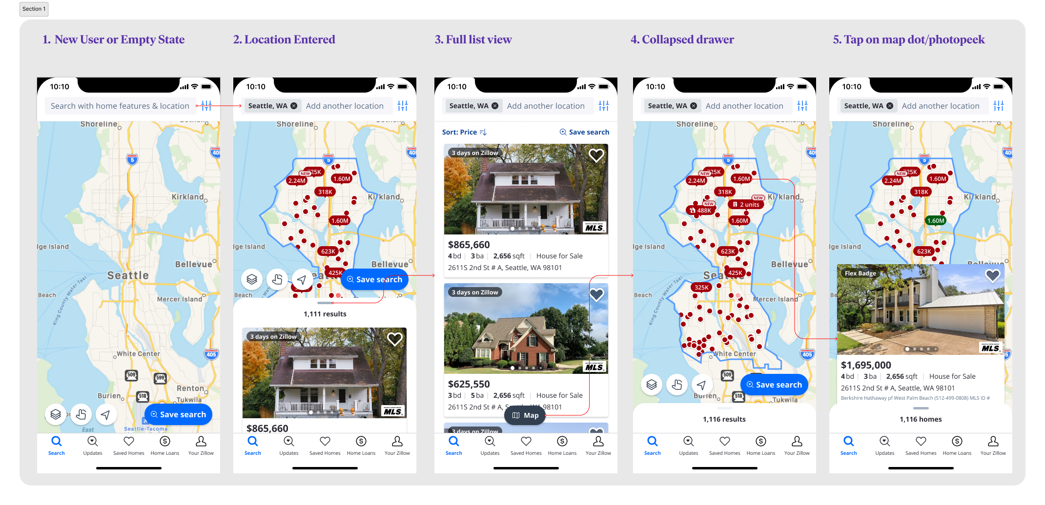
- Full mapThe bottom card stays partially visible over the map, advertising the list without requiring discovery or a mode switch.
- PeekDragging down maximizes spatial context while keeping search filters and the saved-search CTA in place.
- Full listDragging up transitions into a high-density, scrollable listing feed without resetting scroll state.
How I got here
A quick audit of the existing UI
1Users report not finding “list view” or “current location.”
2Not enough space for multi-region or NLP text in the search bar.
3The business is moving away from the toggle.
4“Save” is an uncomprehended element — users select it trying to save a home, and don’t know where the search went.
5Controls sit outside the thumb zone and are ever-present, even in a property-card focus state.
6Map controls have inconsistent appearance, adding to cognitive load.
7Low usage of Constellation components, making the screen less consistent and more expensive to maintain.
Design sprint
I co-led a design sprint to use the list-view problem as a springboard for Zillow’s future search strategy.
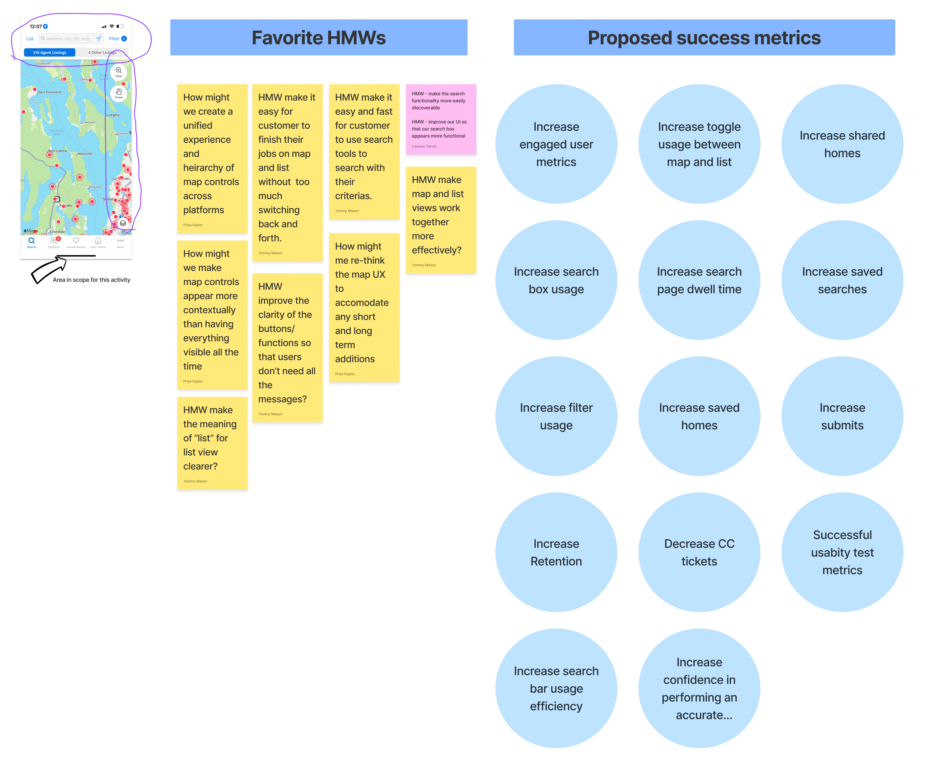
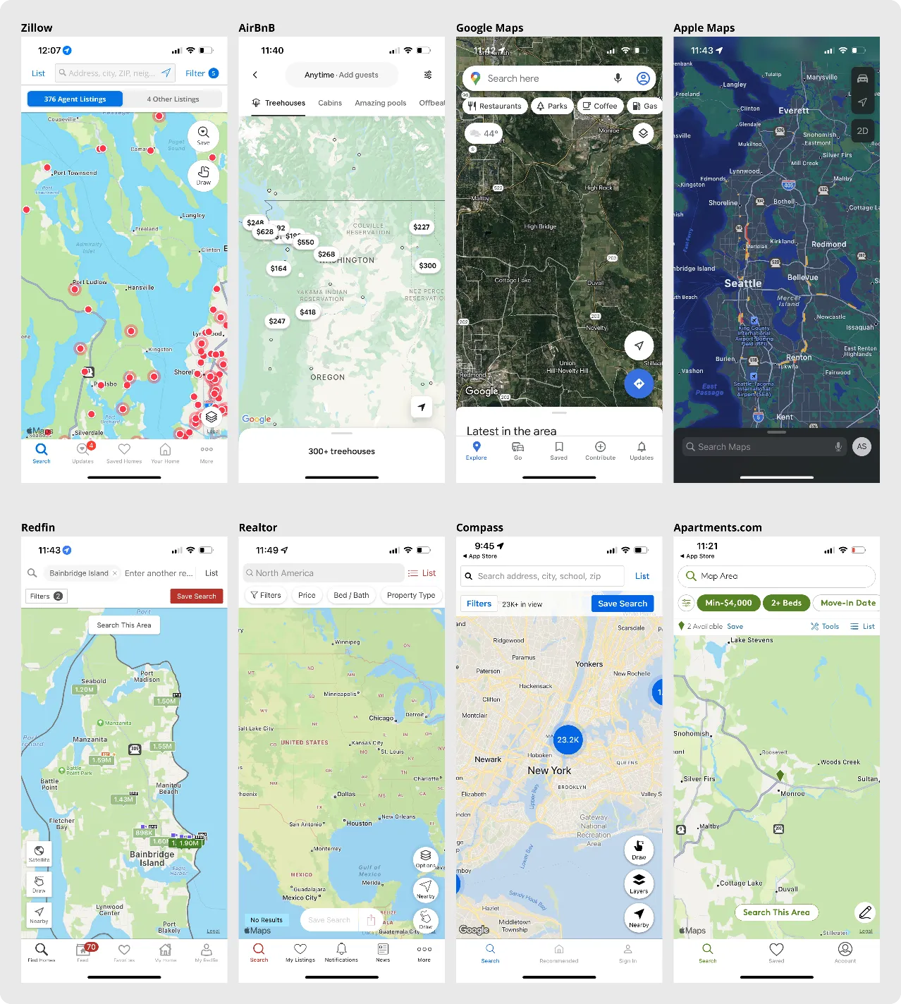
Competitive scan · 2021
Followed by a competitive analysis: all Real-estate apps made users choose between map or list.
Every real-estate app treated the list as a place you navigate to. The only apps where both existed at once weren’t real-estate apps at all — and none of them let the peek carry an actual result.
Exploration
Design directions that I explored
I usability tested with buyers and prototyped three concepts in Figma.
- Cheapest to build
- Switching back and forth carries cognitive load, and it still fails the people who want to start in the list.
- Too many buttons with no hierarchy. All carry the same visual weight, so nothing reads as the primary action.
- Doesn't support planned future Zillow experiences.
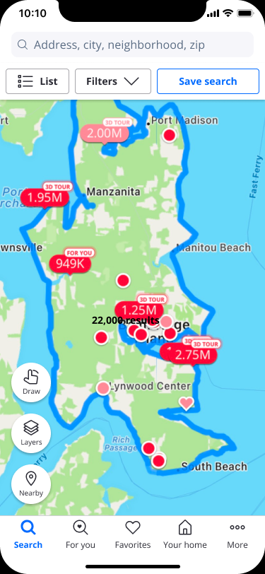
- Grouping primary actions related to search together solved for heirarchy
- Still forced users into the map view by default.
- “List” likely still not comphrensible to users as a list view of properties
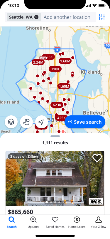
The list sits on top of the map at a peek height, so it announces itself without being opened. There is nothing to discover, nothing to switch between, and no context is lost.
The redesign, one release at a time
Three years. Five releases.
Each step was shipped and tested on its own before the next one started.
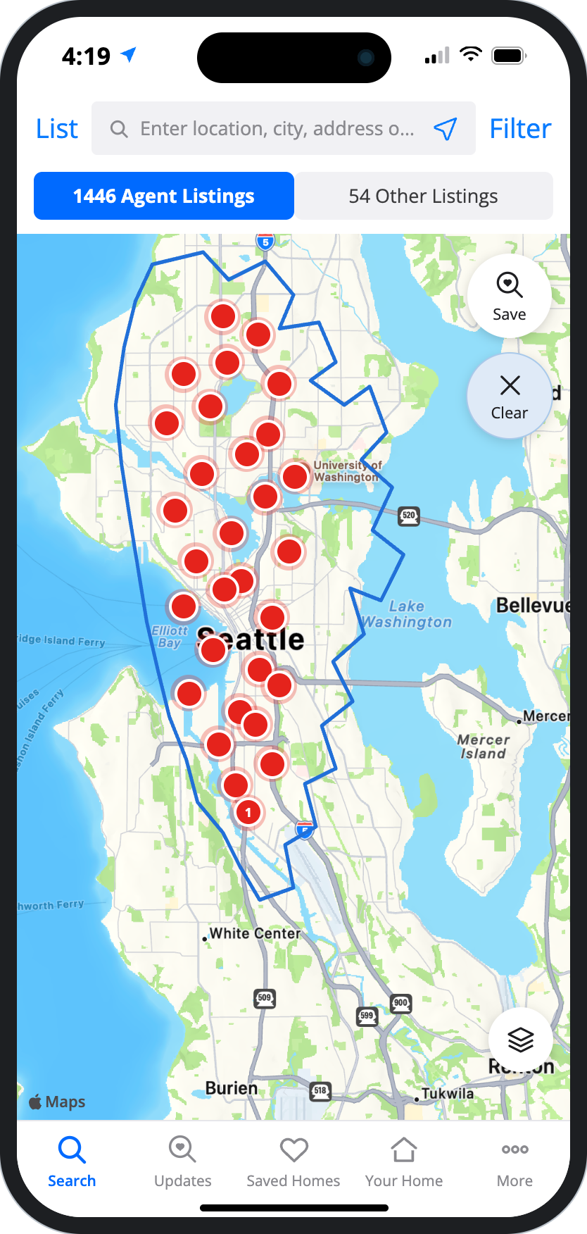
Map-Locked Legacy UI: Map took 100% of the viewport. List and Filter sat as hidden text links in the header, leading to high drop-off and support ticket volume.
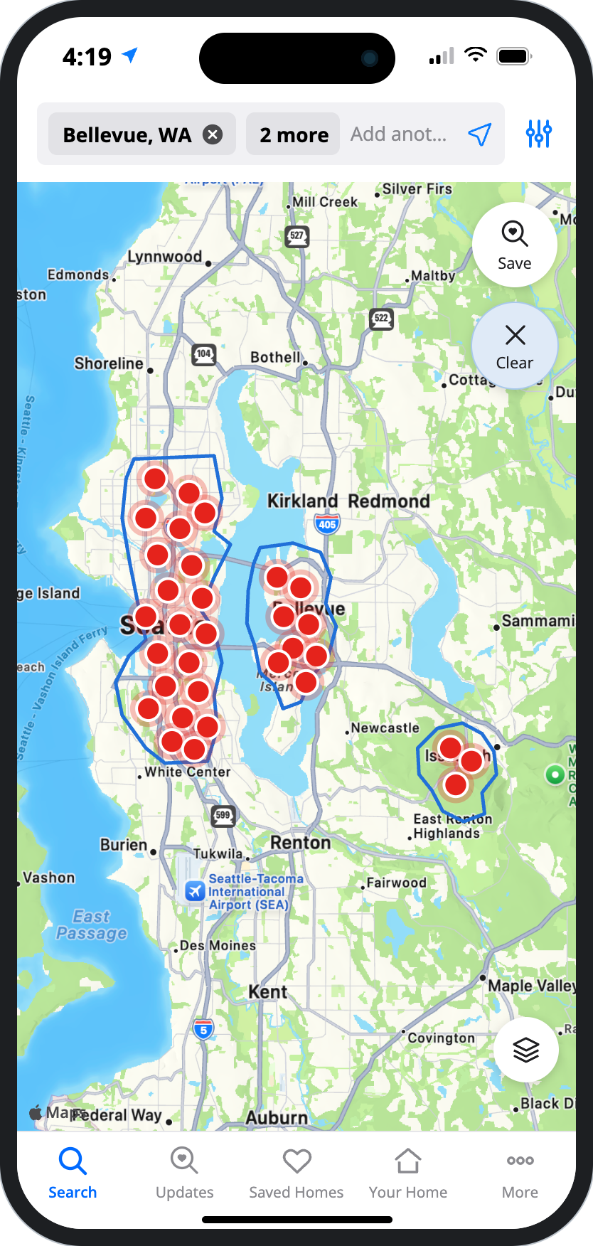
Enabled shoppers to search up to 5 distinct locations simultaneously, merging results into a single map and unified list feed.
In the press Inman July 21, 2022 5 neighborhoods at once: Zillow rolls out new app feature Multi-Region Search made the trade press the week it shipped. Read the story → Zillow Press release · July 21, 2022 Zillow's new tool powers home searches in up to five areas at once The company announcement, framed around letting shoppers move as fast as the market. Read the release →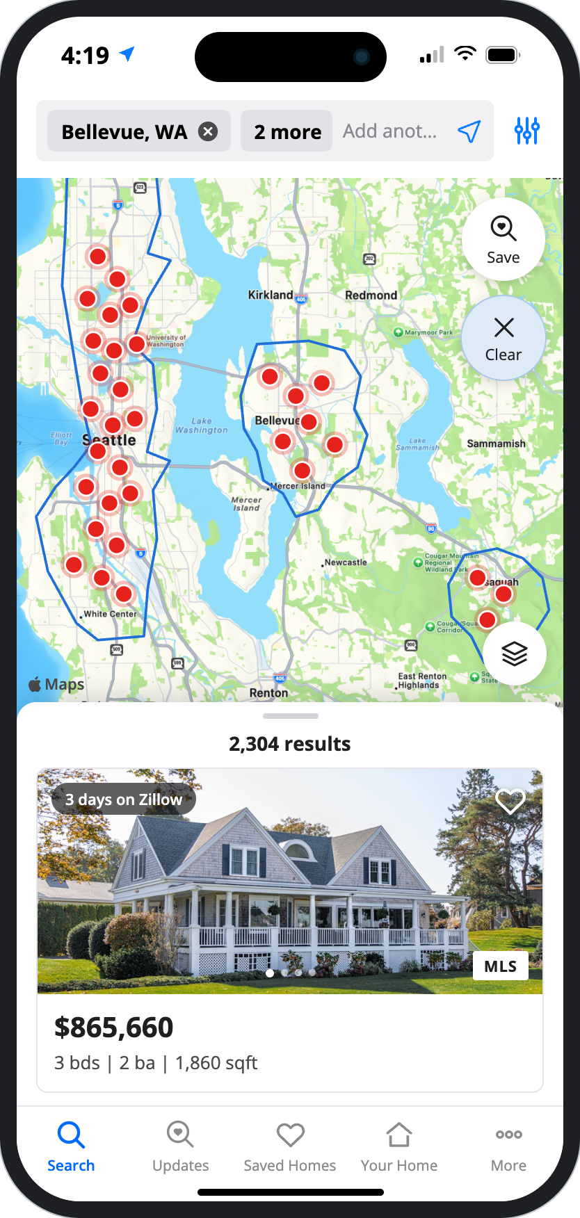
Introduced the persistent bottom sheet over the map. The agent toggle was moved to filters to free up header space.
Why it dropped: New Construction leans on map UX like the "New Construction" dot label, and the blend shifted engagement from map to list. No submits were harmed.
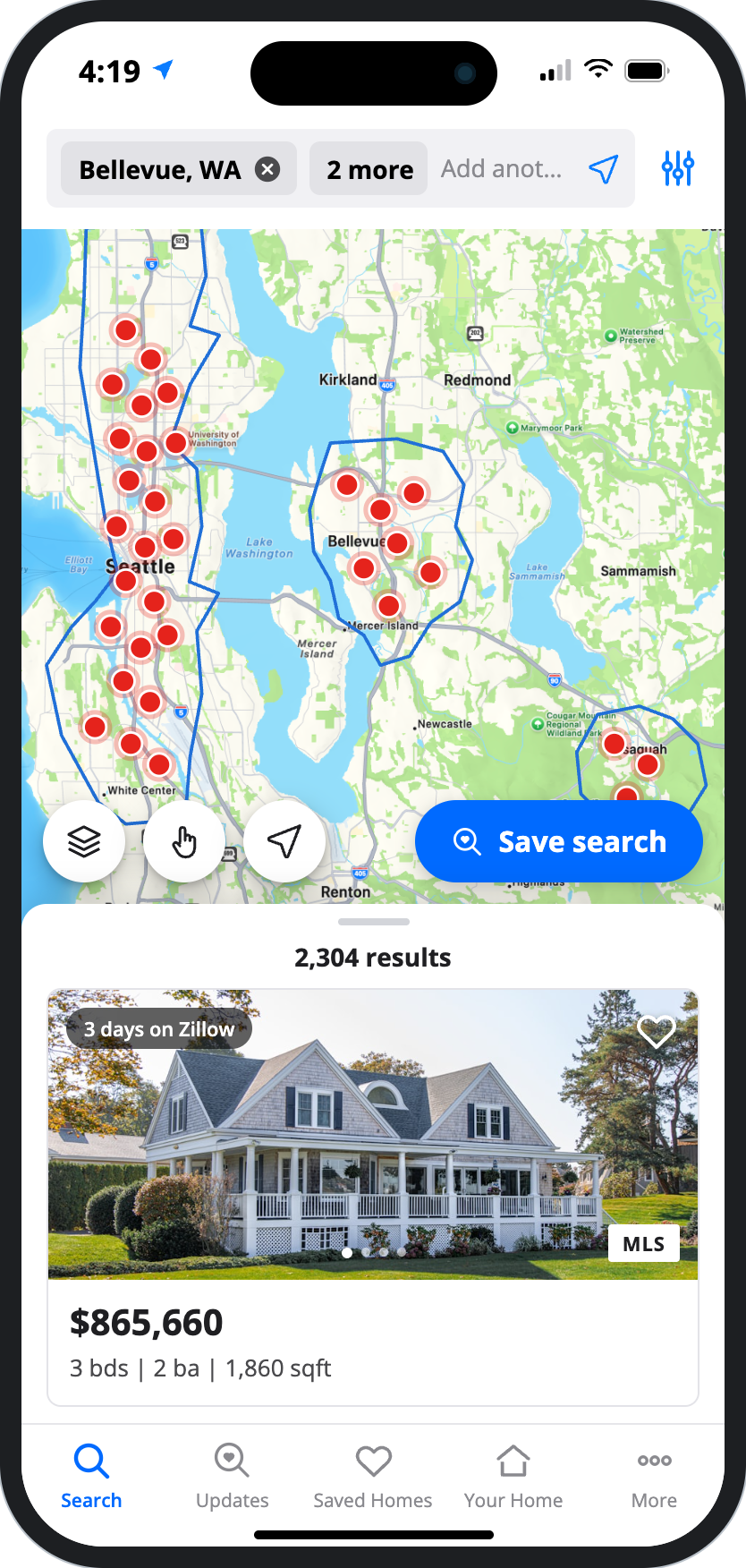
Regrouped header search controls into a single bar, converted text labels to accessible icons, and promoted "Save Search" directly onto the map canvas.
Not everything went up. The shift from map to list cost paid New Construction detail page views 0.4% and mortgage CTA clicks 1.3%. Neither harmed submits, so we turned the new experience up to 100% on the iOS shopping and rental app.
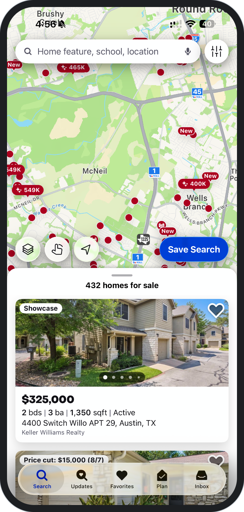
Applied the refreshed brand system end to end across the search experience, from map pins to the results drawer. Zillow went through a multi-year brand refresh starting in 2024, with an updated visual identity, a new brand foundation, and a visually refreshed design system.